Film noir poster final'


|
Murder my sweet is a different type of noir film poster. It holds a different type of font rather than the classic ones. However it does posses the dutch angle title. As far as the image, the pose of the two actors are showing affection and gives us an insight on what the film would be about. The lighting is shone upon the faces of the actors, to give them as one unit. The protagonist wears traditional noir clothes, like the fedora hat and his suit, although the femme fatal isn't wearing a dress of some sort, this could indicate something new, but she is wearing red lipstick and shows her blonde hair. The title again has a slant to it and it is very similar to the saying 'Home Sweet Home',but of course is referring to death.
|

|
This Poster has all the conventions of a typical film noir poster. It includes a usual, 'dark' backdrop. This sits in quite nicely to the fact that the title of the film is called 'The Dark Corner'. Also the Venetian blinds are a perfect combination with the Chiaroscuro lighting that is portrayed across the protagonists face. However we can also see the femme fatal's full body position. I think this is quite unusual because normally we see the femme fatal as being the more devious character, and therefore her face is enlarged on the poster rather than the protagonist. Moving onto the title, the title almost corresponds with the colour of the femme fatals dress, although on its own, it has a very traditional 3D like title, the way its slanted almost like a dutch angle. The the credits and casting is very noir like. The first names are smaller than the surnames, and the credits are right at the bottom, (director, producer ect...).
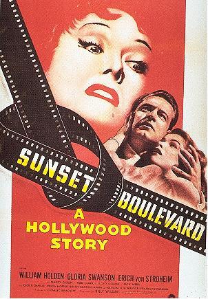
Sunset Boulevard's poster is the most creative in my opinion as it carries a strong backdrop and a unique title font compared to the others. We can see he Lady's red hair has fit into the whole backdrop but the title font is along a movie tape. Also the tape is has strapped itself across the poster. Apart from the image's and title, the chiaroscuro lighting is shone brightly upon the enlarged lady's head. Again typical noir conventions are being shown, for instance the red lipstick corresponds with the red hair and the location in itself is very iconic (Hollywood). At the bottom of the poster there's a phrase that says, ' A Hollywood Story '. This could show what Hollywood could be like or an experience to show its local presence. A very good representation of art with the intervening tape recordings and the cropped picture. |
noir poster drafts (initial)

|
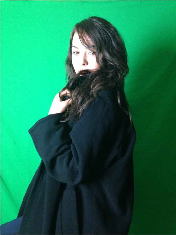
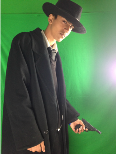
For my first draft, I thought it was best for me to take a look at other well known Film noir posters to give me an insight. As you can tell i have took a poster design of 'The Dark Corner'. I have slightly modified it to the recent film noir opening, I have created. There are the fundamental elements of this initial draft such as the dutch angle title, protagonist, femme fatal, casting line in the middle, producers (Warner Bros.) shoved to the bottom left and finally the directors and assistants and others along the bottom.
|